How did you use new media technologies in the construction and research, planning and evaluation stages?
The programmes/sites we used in each stage of the film making process, and how they were used:
Research:
Blogger - Blogger was once again used here to show how we were researching our band and their image, and also to show how we were reseaching our video, for example uploading posts containing images of things we researched to give a rough idea of how our video would look.
Wikipedia - This was particularily useful in researching our band, the Prodigy, finding out key things relevant to the bands image (e.g. names of albums, instruments used etc), but also provided us with the neccessary information to contact the band's record label (Cooking Vinyl) to ask for copyright permission to use the track we wanted.
Twitter -We used twitter as a way of find out out all about the bands audience, who followed them etc. and also the things the band stood for by what they were tweeting about. By looking at who follwoed the band, we were able to get a good idea of who our target audience would be looking, looking at what they wear through they're images, and the thigns of itnernet to them, by reading both the 'About Me' section, and their tweets.
Google - we used Google a lot in the research, particularily for the digipak and advert research, looking at images of example adverts and band logos, looking at digipaks from similar artists, so we knew what kind of thing to create, and opposite artists, so we knew what to avoid.
Planning:
Blogger - we used this as our online diary to each individually keep a record throughout the whole process (it was used to record and show evidence of our planning - e.g. the storyboard was uploaded onto this, as well as a list with our initial ideas etc.)
Powerpoint - We used lots of powerpoints in the planning stage of production. They were used as a clear, concise way in which to show our ideas and give a visual idea of how they would look.
Google - The search engline was key to the planning stage. I used it to find images of how I wanted my idea to look, and also as a way of sourcing props we might use.
Mobile Phone - This was used when we looked at initial locations for our first idea (in the wood). We took photos of the setting and uploaded them from our mobiles to blogger. We also used our phones to take photos of shots we might choose to feature in our video (placing someone in the position with the shot where we would wnat to see them, then capturing it on our phones).
Photoshop - Photoshop was used as a tool to create a band image for the chosen band. We took photos of the people we wanted to cast, and then imposed their faces onto bodies wearing the clothes that we would be likely to dress them in. Although the end result looked a little bit odd, it gave a rough idea of how they might look. We also used it in creating our graphic design for the front cover of our digipak and advert, and we created a variety of designs to choose from. We used the Selection tool to cut bits from different images and add them together, but in a very basic way as we did not want to spend tolong creating the image of the band on Photoshop.
Youtube- We used Youtube as a way of listening to songs that fit to the ideas we had come up with. Once we decided on the idea, we then brainstormed bands and artists which would be likely to have a similar themed video, and listened to a selection of their songs through Youtube, before finally deciding on 'Warriors Dance.' We also used Youtube as a way of sourcing other ideos which looked like we felt ours wanted to, for example, the Smirnoff advert, which we were able to take screenshots of.
Ebay - Whilst most of our props were supplied by the school, the animal masks were something that they didn't have, so we used Ebay to purchase as many masks as we needed at a cheap cost. I typed in 'animal masks' and was able to szource them quickly and efficiently, using PayPal to pay for them.
Construction:
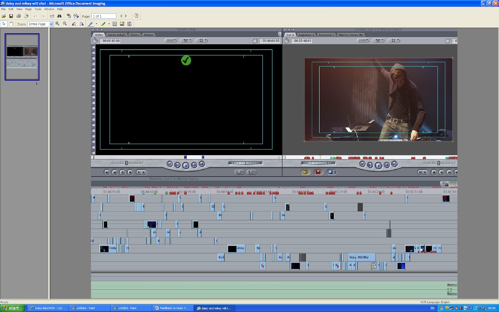
Final Cut Pro - This was the main program that we used during the construction of the video. It was what put the whole video together, as it was our only editing tool used for the video. The advanced technology of the program enabled us to create jump cuts, mirror images and blurred effects to give our video the 'trippy' effect we had researched, such as 'Earthquake' and 'Mirror'. It is enabled us to create a smooth transition between the shots as we were able to overlay the shots to prevent a blank shot.
The program's advanced technology was perfect for editing our video - in order to cut shots you need only drag the mouse to where you want to cut the shot, which was quick and easy to do. We also used the tools 'Modify', 'Sequence' and 'effects'. This was to edit the look of some shots we were not happy with, layer over cool effects to really emphasis the message of our band and ensure that the video ran smoothly together.
Photoshop - We used Photoshop as the key tool to create our digipak and adverts. It was a brilliant program to use, due to its flexibility. We were able to change and edit our image, add text for the poster, and refine things. It meant that unlike designing the ancillary texts by hand, we wouldn't have to start from scratch if we decided we didn't like something. We used the range of tools, such as 'Layer' to add and experiment with different backgrounds, 'Filter' to alter the colours, contrast and intensity of the image. We used the 'T' button to overlay our text, which we sourced from a site called 'Urban Fonts'. The 'Eyedropper Tool' was also particularily useful in making sure our colours all matched throughout the digipak, as we were able to extract colour form certain areas (e.g. the lips, and put this colour into other areas of the advert and digipak).
Evaluation:
Powerpoint - I used this in my first evaluation task as a way of clarly presenting how my products challenged and conformed to media conventions. It enabled me to present information alognside screengrabs. Via the toolbar at the top I was able to add pictures easily via 'Insert', and text using the Text Box button.
iPad - We used this to film our focus group, as it gave a better quality picture and sound than a mobile phone would, and was also then easily uploaded on to Youtube, because it was already connected to the internet.
Blogger - Firstly, I used Blogger to look back at all my posts from this unit, in order to complete the evaluation tasks to the best and most accurate ability possible. I also used it to display my powerpoints and posts summarising and evaluating
Scribd - I used this online program to put my powerpoint presentation on to Blogger for my first evaluation task as I couldn't get Slideshare to work. It was useful to use a different program because it added a new look to the presentation of powerpoints on the blog, giving the overall look variety. It was very easy to use, I only had to create an account which took a few minutes, and then upload my powerpoint ot the site. I was then provided with an Embed code, which I simply added to my blog.
What have you learned from your audience feedback?
For this evaluation task, we used two different sources in order to get some feedback from our audience and also to see how our idea was percieved by people who saw only the finished product, and none of the research or planning.
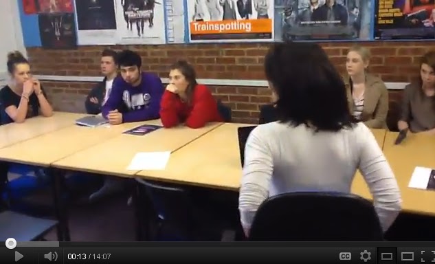
We asked a focus group, made up of males and females aged 16 - 18, if they could come and give some constructive criticism and feedback relating to our video and ancillary texts, in order to help us understand how our texts were perceived by people outside of the production process. Unfortunately we were not able to get an audience of a larger age range, given the fact that we are at school, but it still gave us feedback from that audience category. We used a focus group as opposed to another method, such as a questionnaire, or using Youtube comments alone, because when you are asking questions in person, people consider their questions more carefully, and are able to give more detail in their answers. It also allowed us to visually see how the audience reacted to our product.
We showed them the music video first, and then the digipak and poster.
After showing the video, we constructed a set of questions to ask them (it was important that the questions were open ended, in order to get as much relevant feedback possible).
One of the boys in our focus group, when asked what they liked and disliked about the video said - 'was it meant to be jumpy?' This worried us slightly because the whole point of the video was to make it look like a trippy wierd dream, however when we said yes, he replied that he 'thought it was quite cool', which was a positive response, as we wanted to create something which was relevant to a younger audience.
One of the females from our focus group also said she thought the casting was good, and understood the contrast between 'the girl with the black hair', and 'Abbi in the white dress', which is what we wanted to achieve - a clear contrast between the innocent and the seductive.
Some said that they found the lip-synching a bit out of time, and slightly off-putting, however, this issue seemed to be divided in the focus group, as two of the boys said that they hadn't noticed it. One girl said she found it off-putting as 'you were concentrating on that far more', but when we asked for a show of hands as to who found it distracting, half did and half didn't.
Almost everybody noticed that Holly (our lead singer) was meant to be a sex symbol, and understood how we had presented her in this way in the video:
we asked 'how did you think she was supposed to be a sex symbol', to which one girl replied 'the rope, her costume and the make-up...and also the way she was singing into the camera.' This was positive for us, because the way we styled Holly and directed her to behave on the set was in order to create this sexual image, so I feel that was quite good.
We were slightly worried about the editing, as we felt in places in was perhaps a bit too jumpy - however, our audience feedback was heartening. We asked if they found it too jumpy, but they were all enthusiastic about it, saying it went very well with the song. The majority also felt it made the song' better and more enjoyable.'
One girl said she also enjoyed the 'cool effects' in particular the way Holly's face was 'shaking', as she felt that it 'went with the club scene', which of course, is what we were trying to create.
We moved on to talking about the animals, as we were not sure how well our narrative would come across, due to the fact we had to change it on the day because of bad weather. One girl said because 'they were so wierd, it was interesting', and when we asked what they thought they were there for, the responses were positive; 'animalistic', 'wild' and 'drug-like' were a few of the words used to describe the animals. In this respect, I feel that the animals worked well. One girl also said that they 'acted like the mask', and weren't 'just people dancing', which was encouraging.
One question we asked which was quite important was 'what you do think could be improved in the video?'
We got some useful feedback from this question - some people felt that the narrative could have been emphasised a little better, with 'more of a storyline'. One boy also said that he would have preferred to see more locations, for variety, which we agreed with. A girl from the group said that although she agreed, it made her want to see more of the video, which was positive because it shows it captured an audience.
We then moved on to looking at our digipak and advert. The first impressions of these were good - the mouth open made a girl think that they were a 'wild and out there' band. They also felt the band would be young and 'out of control' relating to our original ideas of resisting against normal, polite society, so it was encouraging that these ideas came across. They also felt that the mouth logo went well with the lead singer, as in the video there was a lot of emphasis on her mouth, showing the texts linked together.
We then asked what they thought the band stood for - some thought they seemed like a rock band, and some said teenagers, which was interesting because this was obviously not how we had intended for them to come across. However, lots of the focus group's ideas about the band image fitted with the one we tried to create - one girl said she thought if they had a slogan, it would be 'something quite dark'.
We were pleased that the focus group felt the band's target audience was around 16-25, which is what we had intended it to be. This showed that the ideas we were communicating in our texts were coming across as intended.
The last question we asked was what they made of the animals being there - it seemed that the storyline we had intended didn't really translate across to the audience - one girl said she didn't understand why there were there, but they didn't seem out of place within the video. This showed that they fitted well within the genre, but we could have made the narrative clearer (however, I think that was partly due to the change of plan because of the bad weather on the shoot day.)
In light of the answers we were given to our questions, I think that the main reason as to why an audience member would choose to watch our product is as a 'diversion' meaning that they would choose to watch the video as a way of escapism. We got this impression from comments such as 'wild' and 'drug like' - drugs are obviously used to alter perspective, and our video is out of the ordinary in terms of its narrative, therefore acts as a diversion from mundane daily life.
All in all, I felt that our focus group was incredibly useful - it gave us a new perspective on how our texts were received by our audience, and also showed us what worked and what didn't.
The other source we used was the comments on our Youtube video - however, as is in shown in the screenshot below, these were not particularily useful as they were mostly posted by the same user 'wilyam84', one of our friends, so the comments were personal rather that about the video itself. However, if the video gets more publicity on Youtube, then this could be a useful source if it is veiwed by more people from outside of the school who choose to leave feedback.
How effective is the combination of your main product and ancillary texts?
The main aim of the product is to contribute to creating a star image. According to Dyer, a star is a commodity, not a real person.
The star image we were aiming to create is a band that appeals to and embodies the values of its target audience: Rebellion Anti-authoritarian attitude Hedonism Originality Non mainstream
In terms of our main product, I feel that the video alone gives an accurate representation of the image we are striving to create. Combined with the ancillary texts, I feel the overall image is strong and an accurate representation of the values the band stands for.
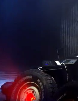
In our video, there are many things which contribute to creating the star image. The location and setting show an urban, hard, industrialised backdrop which could be a warehouse signifying a grimy, urban setting.
The key point about our band image is that they are rebellious. They do not conform to society and are also not afraid to embody social taboos. This rebellious nature is captured in all three media texts we have created – the urban, spray-painted style text on the digipak and advert looks like graffiti – a symbol of rebellion and anarchy.
The lead singer in our video fits in with the image being created by our digipak and advert – the clothing and red lighting compliments the grey, black and red hues of the digipak and advert, and the behaviour of our lead singer is very rebellious and slightly intimidating – which is good because the bands image is not sugary sweet like a pop band, but rather it is a bit threatening to society because they are behaving as they want and break rules within society.Many of our shots show our lead singer snarling into the camera, with a lot of emphasis on her mouth. On our digipak and advert, the graphic design on the front is a mouth – with a tongue piercing (another sign of rebellion), and slightly pointed teeth, making it look slightly sinister, like the narrative of our video.
The fact she is often seen leaning into the camera, or looking straight at it, makes her appear present within the video, and makes the viewer feel like they really know her. This relates to Dyer’s theory of a star being simultaneously present and absent from the consumer – she appears present because she is making intense eye contact with the camera, and it is very much focused on her face, but yet she is also obviously absent. She is also ordinary because she is a real girl and a normal person, but extraordinary because she is being presented in a goddess-like way. She is also extraordinary because she has the mosty screen time in the video, indicating that she is special. The rest of the video and the action within the narrative is also extraordinary - the wierd creatures are definitely not something you would see normally - they have been created specifically for the product too add emphasis to the idea of that the band is sinister. The setting is ordinary - the club/warehouse type of atmosphere is a setting which is familiar with the target audience, and the focus on the DJ's electrical equipment, such as an Apple Mac laptop and an iPod will also seem ordinary and recognizable. However, it is the activity in the setting which makes it seem extraordinary - the lead singer is swinging on a rope and the innocent girl being attacked by the strange creatures is clearly something which is extraordinary, creating a sense of drama. The paradox between the ordinary and extraordinary will increase sales, because the band is extraordinary enough in the video to seem special, appealing and desirable, yet still keeps ordinary elements which the target audience can relate to.
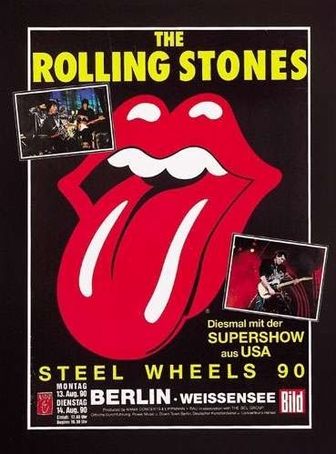
The logo on our advert and digipak is also quite similar to that of The Rolling Stones iconic logo from the 60s - a band who's style is musically different from ours, but stood for similar values such as anarachy and freedom. We decided to make sure that our advert did not differ too much from the look of our digipak - this is so that once the poster is released, it is easily recognizable, and the bold, definite logo is eye-catching.
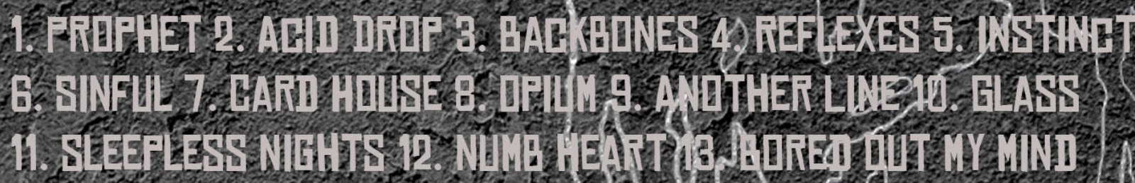
Our track lists on our digipack also reflect the style created in the video. The track names such as ‘acid drop’, ‘opium’, ‘another line’, ‘sinful’ and ‘sleepless nights’ are all suggestive of a wild party lifestyle, hedonism and drug culture.
The shots of our DJ hyping up the crowd is a classic convention within our genre of music. His body language is a bit aggressive, and shows he is totally immersed in the music. This hardcore partying style is reflected in the bold logo and colours of our digipack and advert.
In terms of releasing our promo products, our strategy will be to release our advert poster two weeks before the album is released, then the album, and then our video and singles. Before releasing the video, however, we will re-release the advert with an amended date (out now) to sell the album to people who missed the build up adverts. We will advertise these posters in places where our target audience are likely to hang around or be: train stations, clubs, buses or concert venues. The channels we will put our video on will be less mainstream, so probably not MTV, but channels like NME and possibly Kerrang. These again will be channels which our target audience are likely to watch. These channels also have magazines and we chose to feature reveiws from Kerrang and Rolling Stone on our advert, to really re-inforce the type of audience member we are aiming to target. The five star reviews on the advert help to promote both the video and digipak, because it is showing that the band is good.
Online, we will not advertise our product via pop up advertising, as it would be an annoyance to our target audience. Instead, we will advertise on social networking sites such as Facebook, will link to the video via banner ads, and also use pre-rolls on Youtube videos under the same record label, ‘Cooking Vinyl’ from artists such City and Colour and Groove Armada.
We researched designs for our digipak by looking at different digipaks by similar artists to the Prodigy. The conclusion we came to was that most of the album covers were graphic designs, as opposed to photographic images. The insides of the digipaks were fairly simple, letting the front cover graphic designs do the talking.
Screenshot of Google Images.
As well as using search engines to find digipaks, we also used a website called Sleevage - its a blog where different artists digipaks are displayed, and you can search for digipaks by genre, which was very useful.